What do you use when comparing data sets? Is the tool you are using trustable? Now, a radial bar chart offers the simplest way to compare data sets and give trustable feedback. Most people never want to engage in the task of comparing data sets due to the lots of work and time it takes before getting the work done.
A Radial Bar chart is mostly used for comparison purposes because it does not involve any technicalities in analyzing data. The chart works the same way as a normal bar chart. The only difference is that the radial bar chart uses circular bars to depict data. Also, it has all the features of a good data storytelling tool.
When comparing data sets that you want your market audience to understand, you will obviously need to have a reliable data visualization methodology to present the data findings. When you choose to use a Radial chart in your data visualization activities, you won’t need to spend the whole day working on your data.
It only takes a few clicks, and you will have a concise data output that can answer your visualization questions. Let’s dive right into details and cover everything you need to understand about the Radial bar chart!
What is a Radial Bar Chart?
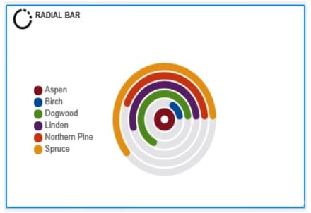
A Radial bar chart is an advanced data visualization model used to compare data variables. The chart is mainly plotted on a coordinate basis instead of a Cartesian plane. This chart operates almost the same way as a typical bar chart. When reading the data displayed, consider the same approach as the bar chart.
However, the chart has circular bars that distinguish it from a bar chart. The circles are meant to depict any existing changes in your data variables. The size of the circular bars on the chart is the same as the magnitude of the change within the data variables.
When the bars are short, it means that the change is relatively small. Contrary, when you record longer bars in the chart, it means that the change that occurred is relatively huge. Provided that you can note the changes that happen on the circular bars, visualizing the change is easier.
This chart type can be used by anyone who wants to understand the change in their data. You don’t need to be an expert in navigating the process. Even if the radial chart operates similarly to a bar chart, the radial chart is used in cases of advanced data visualization.
Remember that the human eye is most attracted to catchy stuff. When presenting your data, you need to take advantage of this fact and use it to present crucial information to your audience. In this chart, every column closes at a different point, so the difference between the two is larger.
If you want to compose impressive reports that your audience will enjoy reading, you don’t need to opt for old-school charts and graphs. The radial bar chart is one of the best choices to use if you want to convey your report concisely and impressively.
Let’s check out how you can build a radial bar chart that depicts your data!
How to Create a Radial Bar Chart?
When you want to create a Radial bar chart, there are two approaches to follow. You can create a Radial bar chart in Excel or use add-ins to complete the job. Choosing the add-ins approach gives you a simple approach since the application you choose has summarized the business nature princess for you.
There are different types of third-party applications on the web that you can download and install on your computer. Provided you have acquired the right tool, you can Integrate it with other software, such as Excel. You only need to export your data on Excel and then give the add-on a chance to process the data and give a clear visual of your data.
The only thing you can do is to make a few edits in the final output to make it suit your preference. However, to use an add-in on your computer, you need to be keen with your choices. Also, you will have to dig deep into your bank account to pay the subscription fee to use the application.
The second approach is using Microsoft Excel to generate your Radial bar chart. Choosing this approach needs you to be well-acquainted with the basics of Excel and have a rough idea of what you intend to get at the end of the process. Creating a Radial bar chart in Excel takes a few minutes since you need to make various adjustments before you come up with the final data output.
The route you choose to use entirely depends on you. If you enjoy playing around with Excel, go for it. And if you do not want to waste time and have some cash to pay the subscription fees, you can opt for any of your preferred add-ins.
When to Use a Radial Bar Chart
There are specific instances where you need to use a Radial bar chart in your data visualization activities. Below are some instances when you need to use a Radial bar chart.
- In-Depth Data Analysis
If you aim to visualize your data and collect all the in-depth insights, the Radial chart is the most reliable option to do the job. The tool converts all the hidden data insights into essential information that the business stakeholders can use. It can also depict how the business expenses have changed over time and any other changes that have taken place in the business.
- Aids in Decision-Making
A Radial chart is an excellent option if you want to display a data story with technical elements. When making strategic decisions within your business, you need a powerful backup system that will help you avoid possible errors. The chart is easy to interpret since everything is clearly brought to display.
- Comparing Entities
Data comparison is a crucial aspect in the world of data visualization. The Radial bar chart does an excellent job in matters of comparing data elements. There are particular aspects of data that can only be seen using special tools. When using this chart, you are likely to spot various elements that display how the data values are related to one another.
Bottom Line
Whenever you are visualizing your data, you will always want to have a tool that has a successful track record of generating compelling outputs. Are you looking for a tool to help you compare your data sets? The Radial bar chart is exactly what you need to make your work easier. This modern tool comes with extensive features that make you enjoy the entire process.
Besides, you don’t need to have any technical expertise to use this chart. Everything outlined in a Radial bar chart is easy to read and understand. If you are searching for a better mode of comparing your data, this chart type has everything you need to visualize your data and identify the existing relationship.